设置社交卡
¥Setting up social cards
Material for MkDocs 可以自动为您的文档创建精美的社交卡片,这些卡片会在社交媒体平台上以链接预览的形式显示。您可以从多种预设布局中进行选择,也可以创建自定义布局以匹配您独特的风格和品牌形象。
¥Material for MkDocs can automatically create beautiful social cards for your documentation, which appear as link previews on social media platforms. You can select from several pre-designed layouts or create custom layouts to match your unique style and branding.
如何创建自定义社交卡@james-willett – 24 分钟 – 了解如何自动创建完全自定义的社交卡片,完美匹配每个页面的品牌!
¥ How to build custom social cards by @james-willett – 24m – Learn how to create entirely custom social cards perfectly matching your branding for each page automatically!
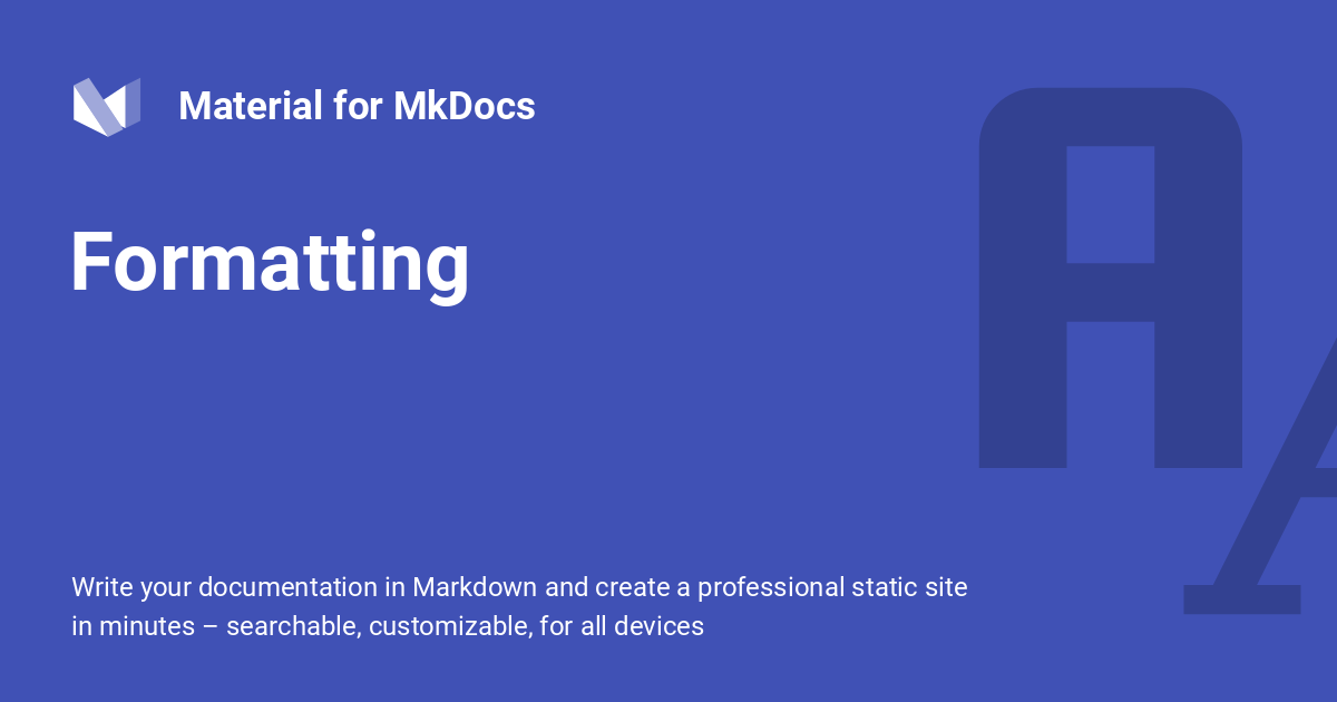
我们的格式参考社交卡
¥Social card of our formatting reference
配置
¥Configuration
内置社交插件
¥Built-in social plugin
8.5.0创建社交卡
¥8.5.0 create-social-cards
内置社交插件会自动为每个页面生成自定义预览图片。安装图片处理所需的所有依赖项,并将以下几行添加到mkdocs.yml中:
¥The built-in social plugin automatically generate a custom preview image for each page. Install all dependencies for image processing and add the following lines to mkdocs.yml:
有关所有设置的列表,请参阅插件文档。
¥For a list of all settings, please consult the plugin documentation.
必须设置site_url设置
¥The site_url setting must be set
请注意,使用社交插件时必须设置site_url ,否则生成的卡片将无法正确链接。X 和 Facebook 等社交媒体服务要求社交预览指向绝对 URL,而插件只有在设置site_url后才能计算该 URL。示例:
¥Note that you must set site_url when using the social plugin, or the generated cards will not be correctly linked. Social media services like X and Facebook demand that social previews point to an absolute URL, which the plugin can only compute when site_url is set. Example:
用法
¥Usage
如果您想要调整社交卡的标题或设置自定义描述,您可以设置前置标题和描述属性(优先于默认值),或者使用:
¥If you want to adjust the title or set a custom description for the social card, you can set the front matter title and description properties, which take precedence over the defaults, or use:
选择字体
¥Choosing a font
某些字体不包含 CJK 字符,例如默认字体 Roboto 。如果您的site_name 、 site_description或页面标题包含 CJK 字符,请从Google Fonts中选择其他包含 CJK 字符的字体,例如Noto Sans字体系列中的字体:
¥Some fonts do not contain CJK characters, like for example the default font, Roboto. In case your site_name, site_description, or page title contain CJK characters, choose another font from Google Fonts which comes with CJK characters, e.g. one from the Noto Sans font family:
更改布局
¥Changing the layout
insiders-4.37.0
如果您想对单个页面(例如您的目标网页)使用不同的布局,您可以将social前置属性与cards_layout键一起使用,就像在mkdocs.yml中一样:
¥If you want to use a different layout for a single page (e.g. your landing page), you can use the social front matter property together with the cards_layout key, exactly as in mkdocs.yml:
您可以将这些更改应用于文档的整个子树,例如,通过使用内置元插件为您的博客和 API 参考生成不同的社交卡。
¥You can apply those changes for entire subtrees of your documentation, e.g., to generate different social cards for your blog and API reference, by using the built-in meta plugin.
参数化布局
¥Parametrizing the layout
insiders-4.37.0
除了更改整个布局之外,您还可以覆盖布局公开的所有选项。这意味着您可以使用自定义前置属性(例如tags 、 date 、 author或您能想到的任何属性)来参数化社交卡片。只需定义cards_layout_options即可:
¥Besides changing the entire layout, you can override all options that a layout exposes. This means you can parametrize social cards with custom front matter properties, such as tags, date, author or anything you can think of. Simply define cards_layout_options:
---
social:
  cards_layout_options:
    background_color: blue # Change background color
    background_image: null # Remove background image
---

# Page title
...
您可以将这些更改应用于文档的整个子树,例如,通过使用内置元插件为您的博客和 API 参考生成不同的社交卡。
¥You can apply those changes for entire subtrees of your documentation, e.g., to generate different social cards for your blog and API reference, by using the built-in meta plugin.
禁用社交卡
¥Disabling social cards
insiders-4.37.0
如果您希望禁用页面的社交卡,只需将以下内容添加到 Markdown 文档的开头:
¥If you wish to disable social cards for a page, simply add the following to the front matter of the Markdown document:
定制
¥Customization
insiders-4.33.0
Insiders对内置社交插件进行了彻底的重写,并引入了基于 YAML 和Jinja 模板组合的全新布局系统 - 与 Material for MkDocs 用于 HTML 模板的引擎相同 - 允许创建复杂的自定义布局:
¥Insiders ships a ground up rewrite of the built-in social plugin and introduces a brand new layout system based on a combination of YAML and Jinja templates – the same engine Material for MkDocs uses for HTML templating – allowing for the creation of complex custom layouts:


社交卡片由图层组成,类似于 Adobe Photoshop 等图形设计软件中的呈现方式。由于每个页面生成的卡片中有许多图层是通用的(例如背景或徽标),内置社交插件可以自动删除重复图层并仅渲染一次,从而显著加快卡片生成速度。生成的卡片会被缓存,以确保仅在内容发生变化时重新生成。
¥Social cards are composed of layers, analogous to how they are represented in graphic design software such as Adobe Photoshop. As many layers are common across the cards generated for each page (e.g., backgrounds or logos), the built-in social plugin can automatically deduplicate layers and render them just once, substantially accelerating card generation. The generated cards are cached to ensure they are only regenerated when their contents change.
布局使用 YAML 语法编写。在开始创建自定义布局之前,最好先研究一下预先设计的布局(链接至Insiders代码库),以便更好地理解它们的工作原理。然后,创建一个新的布局并在mkdocs.yml中引用它:
¥Layouts are written in YAML syntax. Before starting to create a custom layout, it is a good idea to study the pre-designed layouts (link to Insiders repository), in order to get a better understanding of how they work. Then, create a new layout and reference it in mkdocs.yml:
请注意,应省略.yml文件扩展名。接下来,运行mkdocs serve ,查看.cache目录如何填充生成的卡片。在编辑器中打开任意卡片,即可立即看到更改。由于我们尚未定义任何层,因此卡片是透明的。
¥Note that the .yml file extension should be omitted. Next, run mkdocs serve, and see how the .cache directory is populated with the generated cards. Open any card in your editor, so you can see your changes immediately. Since we haven't defined any layers, the cards are transparent.
以下部分介绍如何创建自定义布局。
¥The following sections explain how to create custom layouts.
尺寸和偏移
¥Size and offset
每个图层都有一个关联的尺寸和偏移量,以像素为单位定义。 size由width和height属性定义, offset由x和y属性定义:
¥Each layer has an associated size and offset, which is defined in pixels. The size is defined by a width and height property, and the offset by x and y properties:
size: { width: 1200, height: 630 }
layers:
  - size: { width: 1200, height: 630 }
    offset: { x: 0, y: 0 }
如果省略size ,则默认为布局的尺寸。如果省略偏移offset ,则默认为左上角,即默认的origin 。保存布局并重新加载渲染:
¥If the size is omitted, it defaults to the size of the layout. If the offset is omitted, it defaults to the top left corner, which is the default origin. Saving the layout and reloading renders:

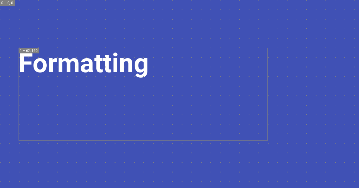
由于我们在mkdocs.yml中启用了调试模式,因此图层轮廓和网格可见。左上角显示了图层索引和偏移量,这对于对齐和合成很有用。
¥The layer outline and grid are visible because we enabled debug mode in mkdocs.yml. The top left shows the layer index and offset, which is useful for alignment and composition.
起源
¥Origin
insiders-4.35.0
可以更改x和y值的origin ,以便图层与布局的边缘或角之一对齐,例如与布局的右下角对齐:
¥The origin for the x and y values can be changed, so that the layer is aligned to one of the edges or corners of the layout, e.g., to the bottom right corner of the layout:
size: { width: 1200, height: 630 }
layers:
  - size: { width: 1200, height: 630 }
    offset: { x: 0, y: 0 }
    origin: end bottom
下表显示了支持的值:
¥The following table shows the supported values:
起源 ¥Origin | ||
|---|---|---|
¥ | ¥ | ¥ |
¥ | ¥ | ¥ |
¥ | ¥ | ¥ |
背景
¥Backgrounds
每个图层都可以指定背景颜色和图像。如果同时指定了颜色和图像,则颜色会渲染在图像之上,从而实现半透明、有色的背景:
¥Each layer can be assigned a background color and image. If both are given, the color is rendered on top of the image, allowing for semi-transparent, tinted backgrounds:


size: { width: 1200, height: 630 }
layers:
- background:
image: layouts/background.png
color: "#4051b5ee" # (1)!
颜色值可以设置为 [CSS 颜色关键字],或者 3、4、6 或 8 个字母的十六进制颜色代码,从而允许半透明层。
¥The color value can be set to a [CSS color keyword], or a 3, 4, 6 or 8 letter HEX color code, allowing for semi-transparent layers.

背景图像会自动缩放以适应图层,同时保持宽高比不变。注意,我们省略了size和offset ,因为我们想要填充社交卡片的整个区域。
¥Background images are automatically scaled to fit the layer while preserving aspect-ratio. Notice how we omitted size and offset, because we want to fill the entire area of the social card.
排版
¥Typography
现在,我们可以添加源自 Markdown 文件的动态排版——这正是内置社交插件的真正存在理由。Jinja模板用于渲染文本字符串,然后将其添加到图像中:
¥Now, we can add dynamic typography that is sourced from Markdown files - this is the actual raison d'être of the built-in social plugin. Jinja templates are used to render a text string that is then added to the image:
size: { width: 1200, height: 630 }
layers:
- size: { width: 832, height: 310 }
offset: { x: 62, y: 160 }
typography:
content: "{{ page.title }}" # (1)!
align: start
color: white
line:
amount: 3
height: 1.25
font:
family: Roboto
style: Bold
Jinja 模板中可以使用以下变量: config.* page.* [
layout.*][layout options] 作者可以自由定义layout.*选项,这些选项可用于将任意数据从mkdocs.yml传递到布局。
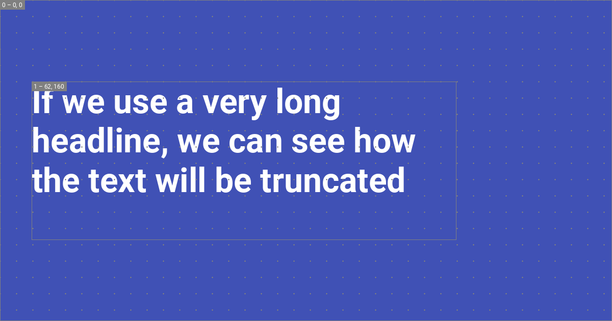
这将渲染一个包含页面标题的文本层,行高为 1.25,最大行数为 3。插件会根据行高、行数以及字体指标(例如上升部和下降部)自动计算字体大小。1 渲染结果如下:
¥The following variables can be used in Jinja templates:
溢出
¥Overflow
如果文本溢出图层,则可能出现两种行为:要么自动截断文本并用省略号缩短,要么自动缩小文本以适合图层:
¥This renders a text layer with the title of the page with a line height of 1.25, and a maximum number of 3 lines. The plugin automatically computes the font size from the line height, the number of lines, and font metrics like ascender and descender.1 This renders:

虽然默认使用省略号截断,但可以通过将overflow设置为shrink来启用自动收缩:
size: { width: 1200, height: 630 }
layers:
- size: { width: 832, height: 310 }
offset: { x: 62, y: 160 }
typography:
content: "{{ page.title }}"
overflow: shrink
align: start
color: white
line:
amount: 3
height: 1.25
font:
family: Roboto
style: Bold
结盟
¥Alignment
文本可以与图层的所有角和边对齐。例如,如果我们想将文本与图层的中间对齐,我们可以将align设置为start center ,这将渲染为:
下表显示了支持的值:
¥Text can be aligned to all corners and edges of the layer. For example, if we want to align the text to the middle of the layer, we can set align to start center, which will render as:
结盟 ¥Alignment | ||
|---|---|---|
¥ | ¥ | ¥ |
¥ | ¥ | ¥ |
¥ | ¥ | ¥ |
字体
¥Font
内置社交插件与Google Fonts集成,可自动为您下载font文件。font 属性接受family和style属性,其中family必须设置为字体名称, style必须设置为支持的字体样式之一。例如,将family设置为Roboto将自动下载以下文件:
.cache/plugins/social/fonts
└─ Roboto/
├─ Black.ttf
├─ Black Italic.ttf
├─ Bold.ttf
├─ Bold Italic.ttf
├─ Italic.ttf
├─ Light.ttf
├─ Light Italic.ttf
├─ Medium.ttf
├─ Medium Italic.ttf
├─ Regular.ttf
├─ Thin.ttf
└─ Thin Italic.ttf
在这种情况下,作者可以使用Bold或Medium Italic作为style 。如果图层中指定的字体样式不属于字体系列,则字体始终会回退为Regular并在调试模式下打印警告,因为所有字体系列都包含Regular 。
¥The following table shows the supported values:
图标
¥Icons
作者可以利用 Material for MkDocs 自带的全部图标,甚至可以使用主题扩展并按照附加图标指南中描述的过程提供自定义图标。甚至可以使用color属性为图标着色:
¥The built-in social plugin integrates with Google Fonts and will automatically download the font files for you. The font property accepts a family and style property, where the family must be set to the name of the font, and the style to one of the supported font styles. For example, setting family to Roboto will automatically download the following files:
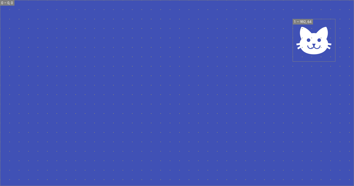
size: { width: 1200, height: 630 }
layers:
  - background:
      color: "#4051b5"
- size: { width: 144, height: 144 }
offset: { x: 992, y: 64 }
icon:
value: material/cat
color: white
这将在社交卡的右上角呈现图标:
¥In that case, the author can use Bold or Medium Italic as the style. If the font style specified in the layer is not part of the font family, the font always falls back to Regular and prints a warning in debug mode, as Regular is included with all font families.
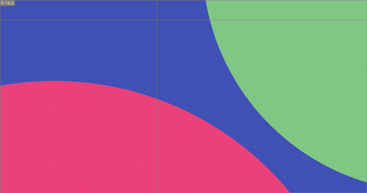
可能性无穷无尽。例如,图标可以用来绘制圆形等形状:
¥This will render the icon in the top right corner of the social card:
size: { width: 1200, height: 630 }
layers:
  - background:
      color: "#4051b5"
  - size: { width: 2400, height: 2400 }
    offset: { x: -1024, y: 64 }
    icon:
      value: material/circle
      color: "#5c6bc0"
  - size: { width: 1800, height: 1800 }
    offset: { x: 512, y: -1024 }
    icon:
      value: material/circle
      color: "#3949ab"
这将在背景中添加两个圆圈:
标签
¥Tags
新的内置社交插件让您可以灵活地添加添加到您网站的元标签,这些标签对于指示 X 或 Discord 等服务如何显示您的社交卡片至关重要。所有默认布局都使用以下标签集,您可以将其复制到您的布局中并进行调整:
¥This will add two circles to the background:
definitions:

  - &page_title_with_site_name >-
    {%- if not page.is_homepage -%}
      {{ page.meta.get("title", page.title) }} - {{ config.site_name }}
    {%- else -%}
      {{ page.meta.get("title", page.title) }}
    {%- endif -%}

  - &page_description >-
    {{ page.meta.get("description", config.site_description) or "" }}

tags:

  og:type: website
  og:title: *page_title_with_site_name
  og:description: *page_description
  og:image: "{{ image.url }}"
  og:image:type: "{{ image.type }}"
  og:image:width: "{{ image.width }}"
  og:image:height: "{{ image.height }}"
  og:url: "{{ page.canonical_url }}"

  twitter:card: summary_large_image
  twitter:title: *page_title_with_site_name
  twitter:description: *page_description
  twitter:image: "{{ image.url }}"
请注意,此示例使用了YAML 锚点来减少重复。definitions definitions仅用于别名的定义,然后可以使用锚点引用。
你遗漏了什么吗?欢迎留言告诉我们!
¥The new built-in social plugin gives full flexibility of the meta tags that are added to your site, which are necessary to instruct services like X or Discord how to display your social card. All default layouts use the following set of tags, which you can copy to your layout and adapt: